Done at Maryland Institute College of Art
Mentored by Jennifer Cole Phillips
Year 2026
RECOGNITIONS
RECOGNITIONS
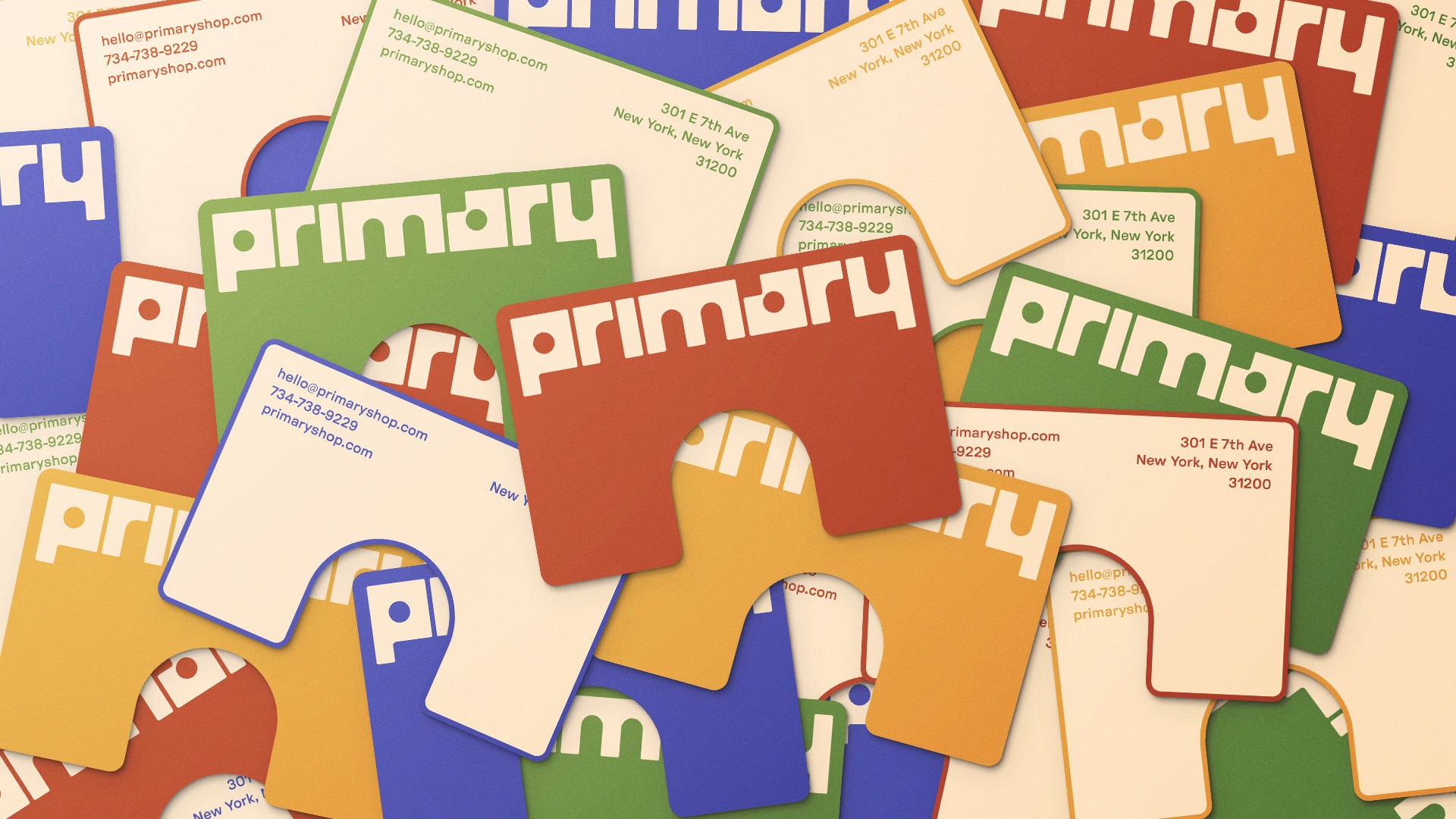
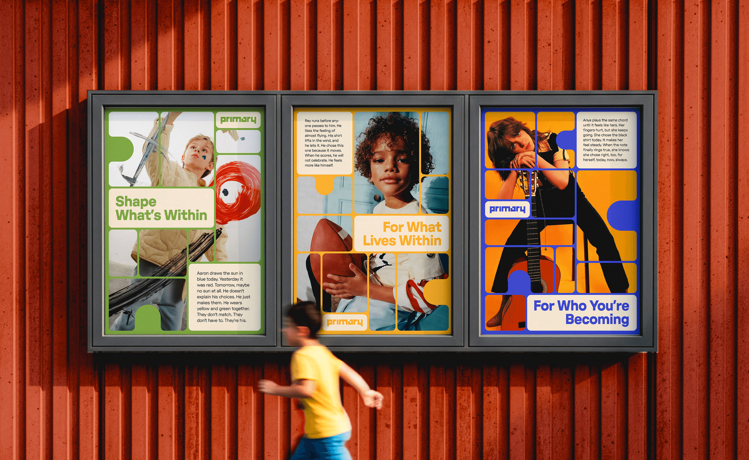
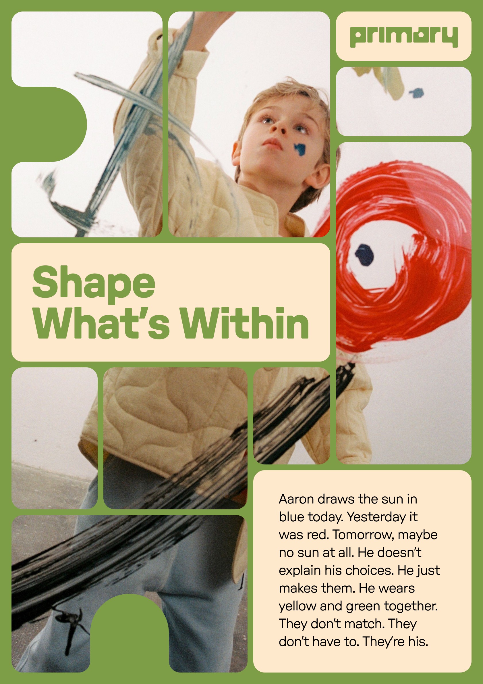
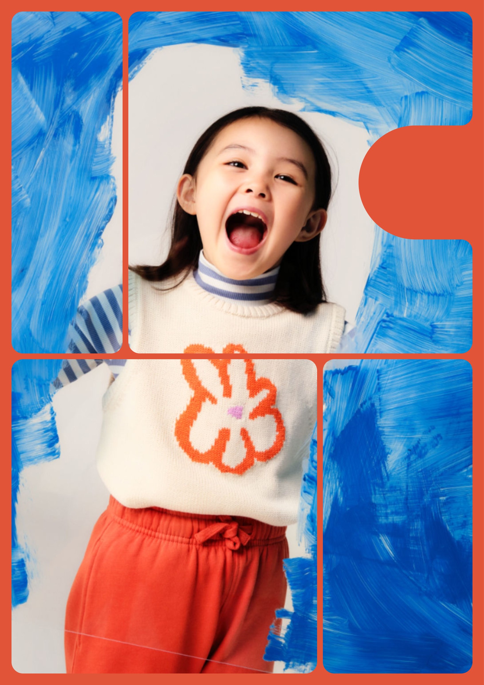
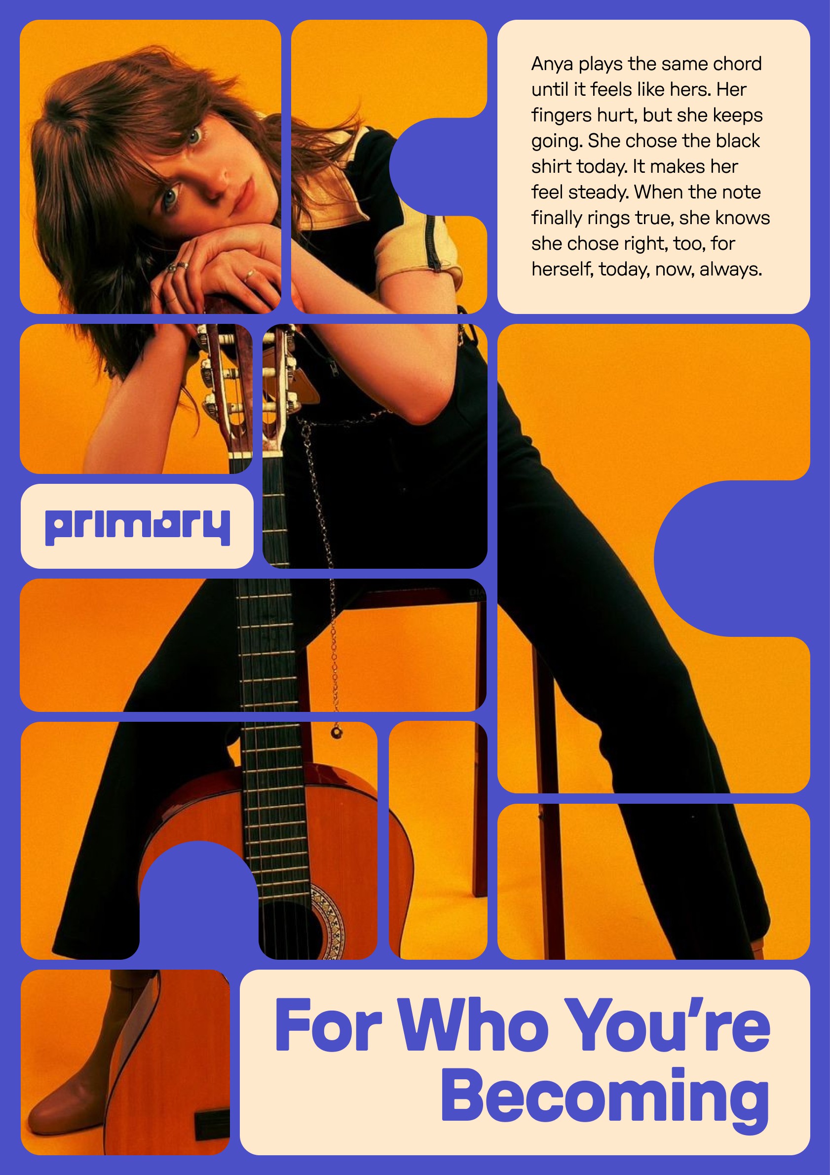
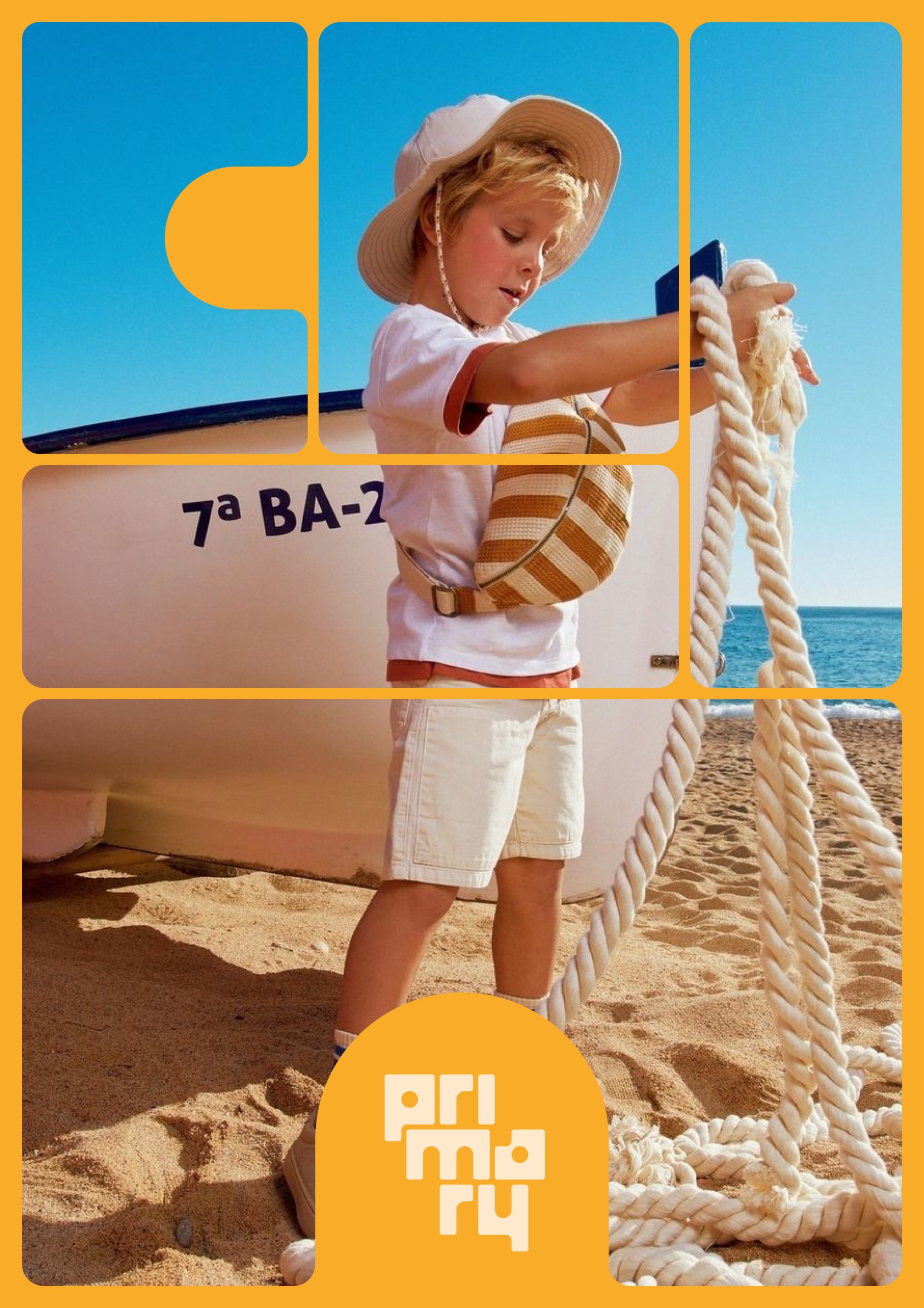
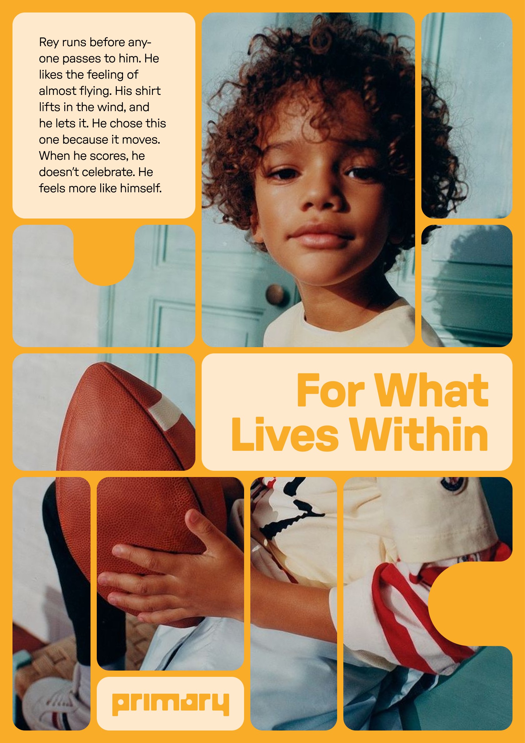
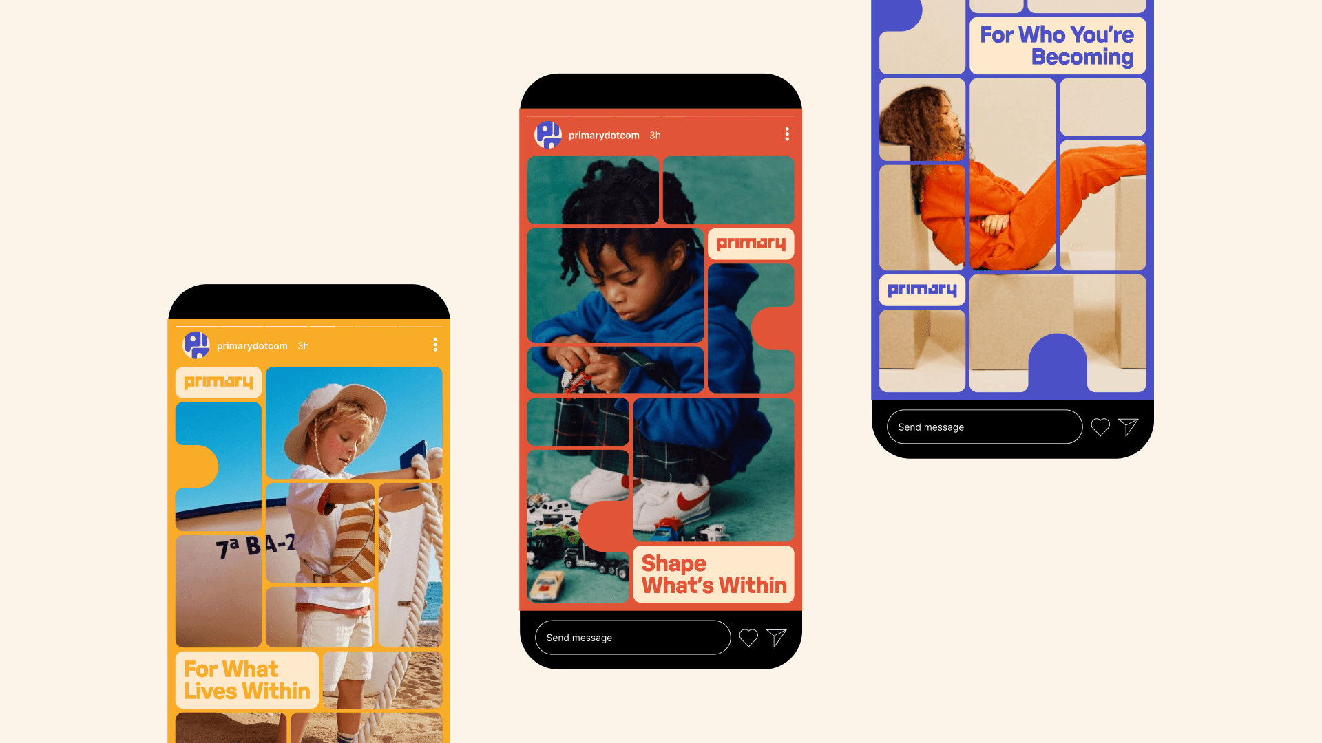
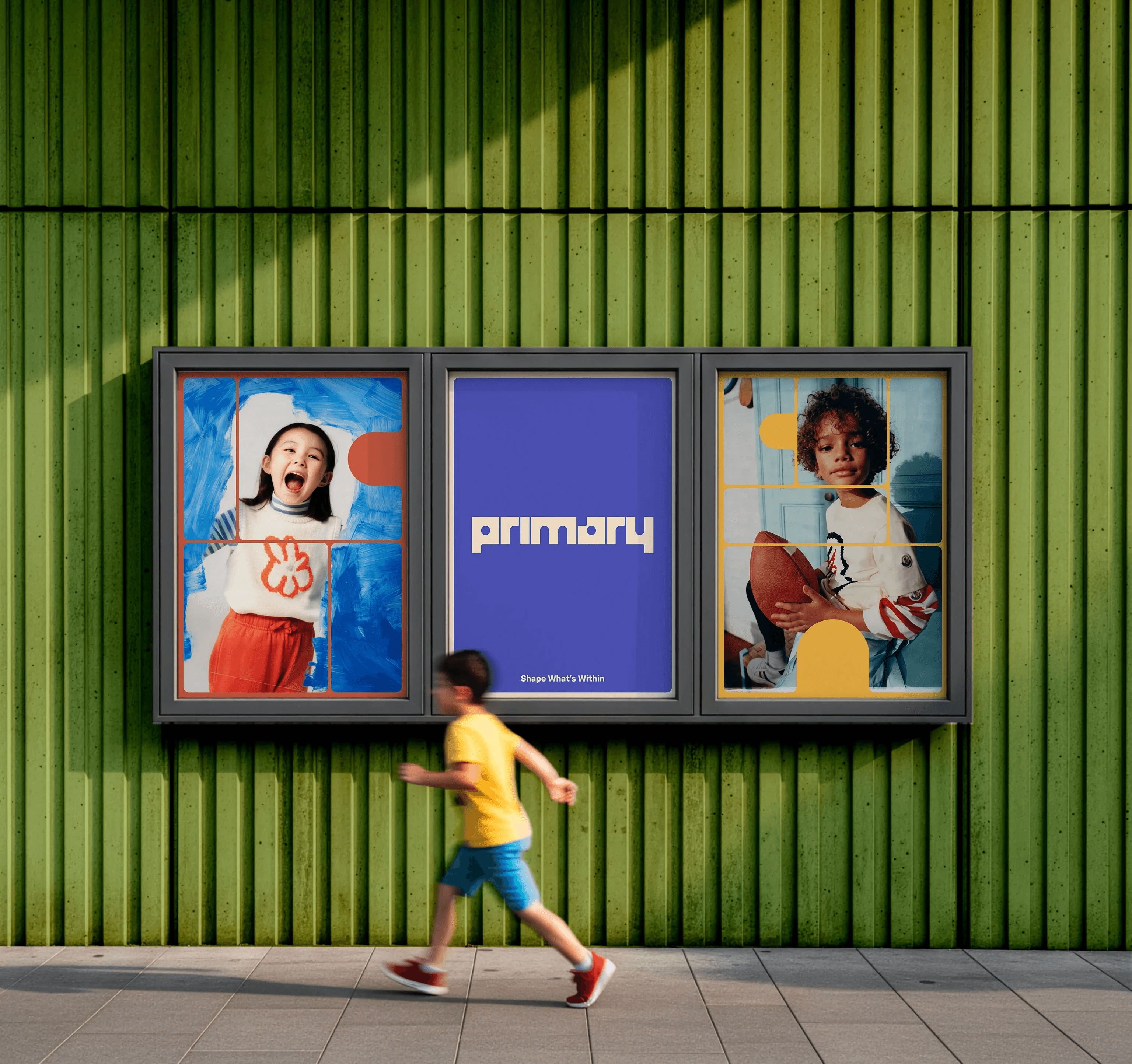
Primary is a visual identity system developed after researching the children’s clothing brand and its core values of minimal, gender-neutral basics. Building on this foundation, I chose to extend the brand toward a stronger focus on self-expression—positioning clothing as something kids actively use to create and define their identity.
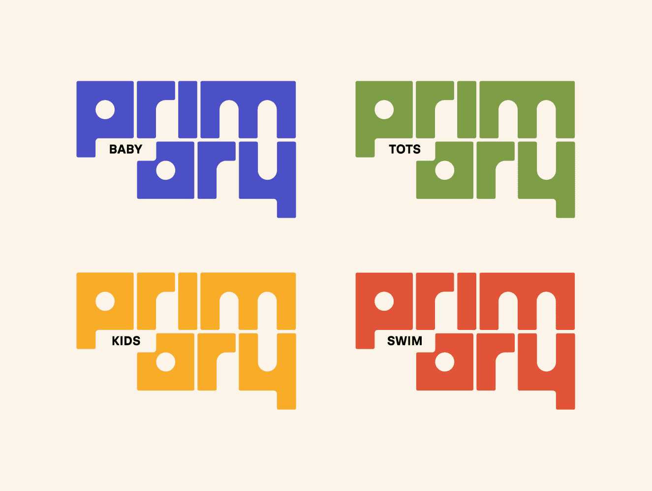
The logo was designed as a stackable system inspired by building blocks, allowing forms to be assembled and rearranged in different configurations. This modular structure reflects the act of mixing and matching garments, reinforcing the idea of creation through styling.
Language became a unifying tool across the identity, using phrases rooted in building and making to connect directly back to clothing. Together, the system frames the brand’s basics not just as essentials, but as components for creative expression.
Done at Maryland Institute College of Art
Mentored by Jennifer Cole Phillips
Year 2026
Primary is a visual identity system developed after researching the children’s clothing brand and its core values of minimal, gender-neutral basics. Building on this foundation, I chose to extend the brand toward a stronger focus on self-expression—positioning clothing as something kids actively use to create and define their identity.
The logo was designed as a stackable system inspired by building blocks, allowing forms to be assembled and rearranged in different configurations. This modular structure reflects the act of mixing and matching garments, reinforcing the idea of creation through styling.
Language became a unifying tool across the identity, using phrases rooted in building and making to connect directly back to clothing. Together, the system frames the brand’s basics not just as essentials, but as components for creative expression.
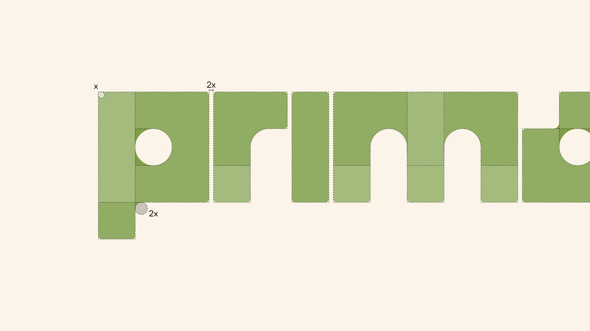
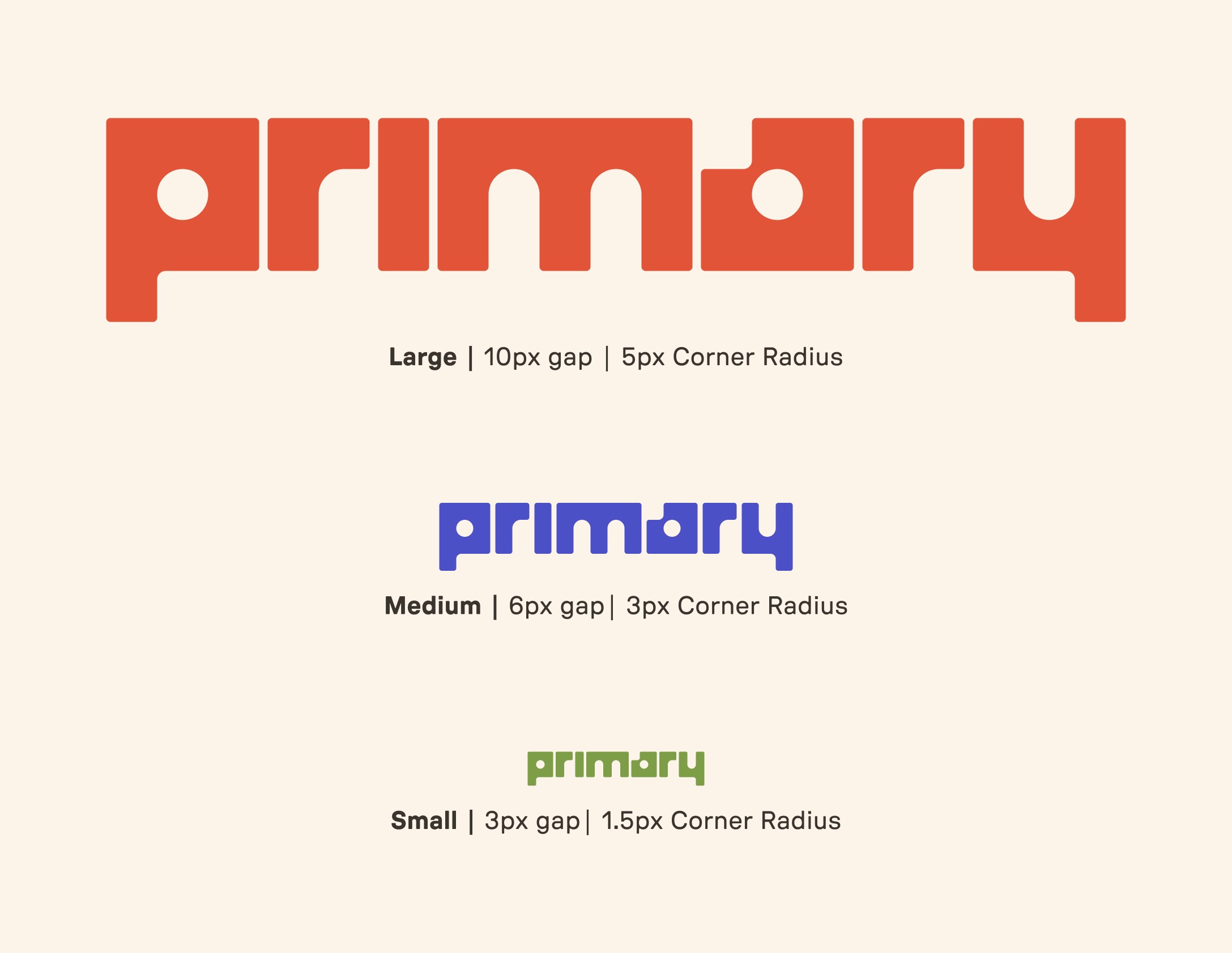
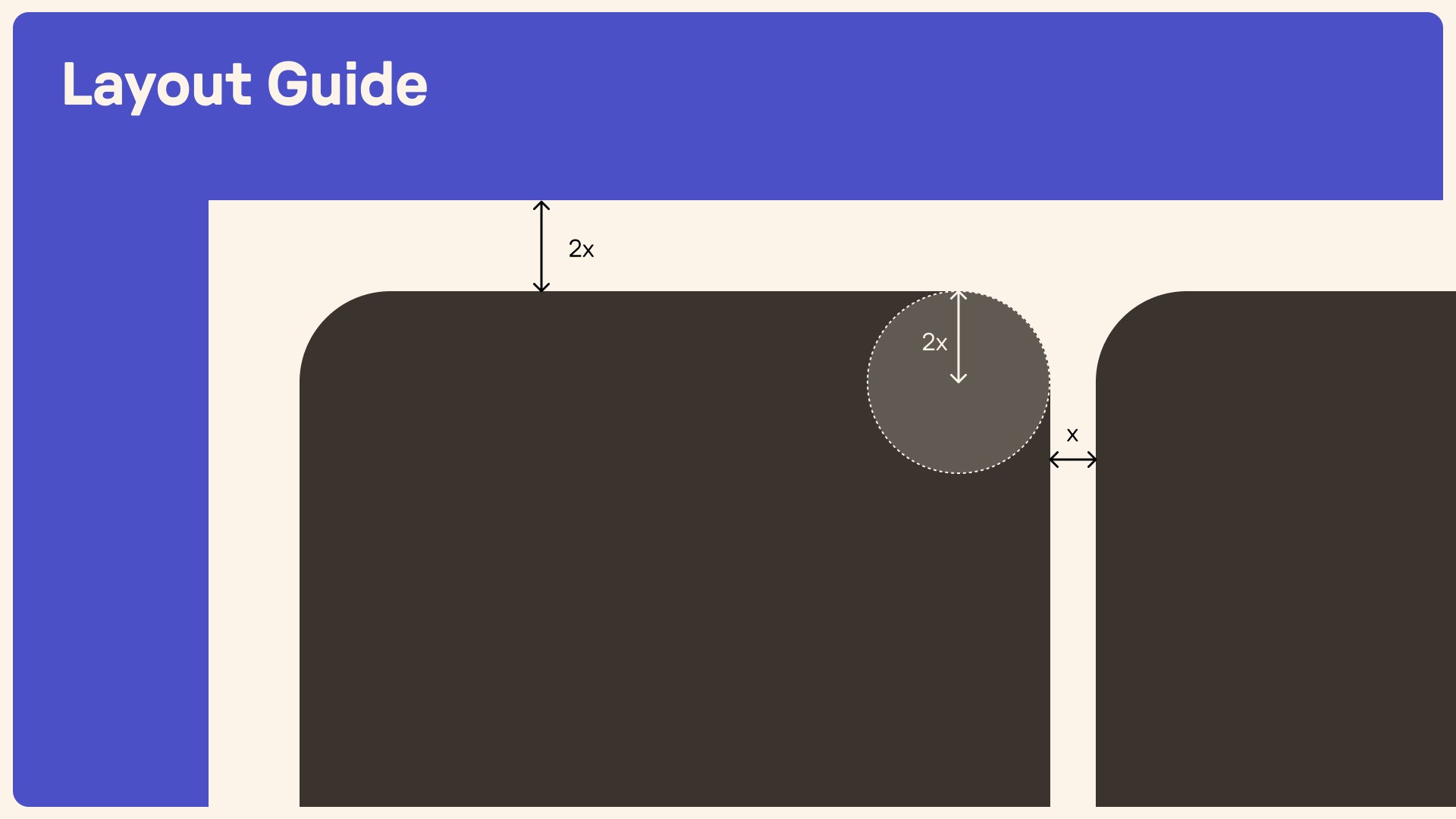
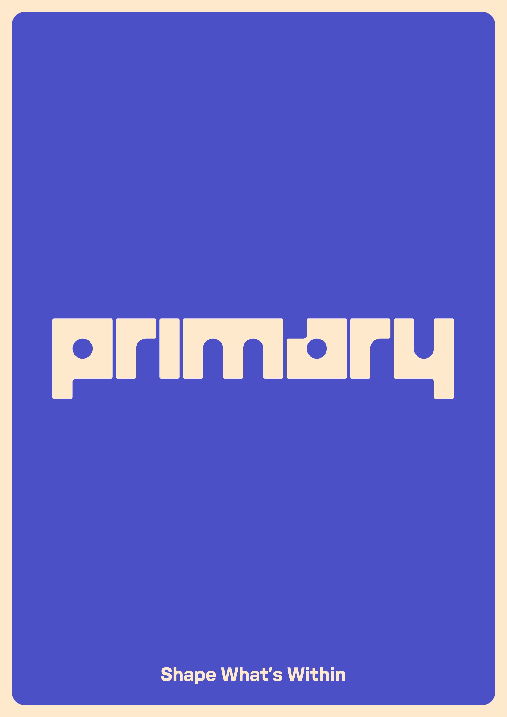
The logo is constructed using a simple, scalable system, ensuring it retains
its distinctive personality and visual in-
tegrity at any size.
The logo is constructed using a simple, scalable system, ensuring it retains
its distinctive personality and visual in-
tegrity at any size.
The logo is constructed using a simple, scalable system, ensuring it retains
its distinctive personality and visual in-
tegrity at any size.